Refactoring a survey product

Problem
Current users like Instant Survey for its value proposition because of Numerator's data and how easy it is for researchers and non-researchers to send simple surveys — though sometimes it was too simple from feedback that was collected since its launch. It lacked features that deterred current and potential users from launching on the platform for. Additionally, there was some manual process that could be automated for operational efficiency which would become problematic as the product was projected to see growth.
The underlying tech for the survey product was not initially built as a survey tool so it needed to be refactored in order to enable future and innovative features. By doing so, we anticipated that it will lead to users sending more surveys through the Instant Survey platform which translated to an increase in revenue in order to stay competitive. The builder needed to stay familiar by keeping some UI elements as established by the design team especially as it was part of a wider ecosystem; we wanted to make sure it looks cohesive and that the change in the flow was not seen as a risk. There were a lot of moving parts (back-end and front-end) in order to enable the team to push forward and innovate, and the user experience was under my scope.
Impact
There was a 40% increase of revenue as more surveys were sent compared to the prior year.
The team was also empowered to work on new features to be competitive and make them more user-friendly.

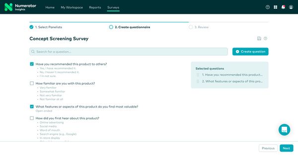
01. After the refactor
This is part of the design we landed on: the information architecture, the user flow and part of the layout were redesigned. It was a good step towards the next iteration to allow more advanced options on the survey builder as it met all of our goals for MVP.
Process
It was really easy for the team to get excited about the product as they had more resources to work on the product. As I was learning about the product, I looked at how other survey platforms worked versus Instant Survey, as well as what we are doing now manually.
As the user flow at the time for creating a survey was not initially built for that purpose, and we knew that when new features would be worked on to expand the product, the product may be doing too much in one page. Certain tasks within the survey creation had to be decoupled to make it easier to send a survey. This meant a change in the information architecture was needed, and the solution needed to be modular to fit different types of surveys users can send.

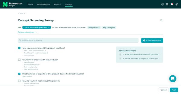
02. Before the refactor
Users were familiar with this survey template; the team didn't want to move away too much at this stage. It's simple, but we found early on that we couldn't iterate on this design for popular requested features without compromising the user experience.
When we tested one of the Figma prototypes with users, they all mentioned preferring the new information architecture as it reduced cognitive load: it helped them focus on the different steps in the survey builder, as certain tasks themselves were sometimes deemed difficult to complete on their own (such as designing a survey as non-researchers). Those findings empowered the team to push ahead with the refactor and gained stakeholder alignment.
We found that while they found it was easier to complete the steps, they were sometimes confused as to where they were in the survey creation depending on certain steps they took. We also uncovered other issues in the product by talking to users that we looked into solving next, as we had to keep our focus on our primary goal. After iterating some more and checking with other stakeholders, we landed on a design that uses a stepper component which was also added in the design system.

02. Before the refactor
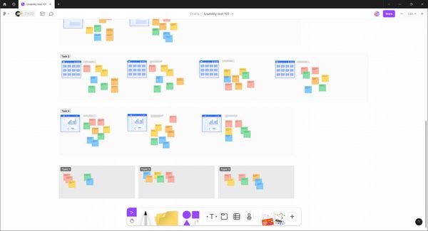
The screenshot is just an example of how I conduct usability tests with FigJam which included the script, screenshots and sticky notes of what the participant said and did which made it easier for me to then synthesize findings through affinity mapping. Important highlights were then shared with the team.
Takeaways
The project unblocked the survey product team to work on features that were often requested by users so they could feel empowered to send surveys on their own.
I believe that conducting usability tests helped to alleviate concerns about the product's direction as changes are often viewed as a risk due to the possible negative impact it may have, so this was a big win in our books in regards to stakeholder alignment. Additionally, we learned a lot more about our users and became more confident in our decisions and our vision for the product.