Streamlining the QC process
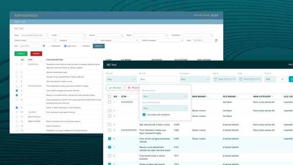
Quality checking on Numerator's data has always been done in the past, but questions from stakeholders regarding accuracy couldn't be answered easily as there were no dedicated tools to collect this type of data. The QC process was not as smooth as it could be — there were a few too many steps involved that could be streamlined. Additionally, the team wanted to transition away from Django’s web framework and make use of React for something more modern and more user-friendly.
The MVP of the QC Tool was being tested by a few select users: team leads who need to check their direct reports’ work before the end of the day and machine learning quality checkers who are training the models used for most of the attributions. As the basic functionality of the tool was still being worked on, there was a lot of ambiguity about what could be done and what the team wanted so requirements changed fairly often during the process.
Impact
- The tool helped speed up the QC process by at least 20% (when it would take 2 hours to process all the data to review, it would take 1h30).
- Feedback from users was positive with these new changes and made the work less like they were working against the tool—users also felt they were listened to, and feedback was still collected on improvements.
Process
The search filters for the MVP were taking a lot of space and the primary actions, “correct” and “wrong” buttons, were not easily accessible as the user scrolls down, so the user needs to scroll back up to complete their task.
One of the big questions the team had was to find a good balance of accuracy and speed. There should be enough information on the table without feeling the need to go through a different flow to investigate the item details as these added more minutes on each item looked at, unless the item in particular was impactful.
I iterated over a few designs as I worked on the task flows from the given requirements the tool should cover based on the workflow users were familiar with. I was a data associate myself, working on attribution and quality check, so I was familiar with the current workflow.
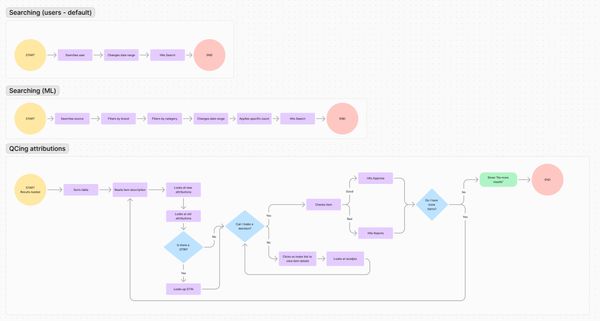
03. Task flows
The workflow was simple: once the data associate was done doing attributions during the day, their team lead would search for their attributions, then they would mark their work as "correct" or "incorrect" before the end of the day in the QC tool. Task flows were created to understand how the user may work on the tool and if it covers what happens once they need to diverge from the path we expect users to take.
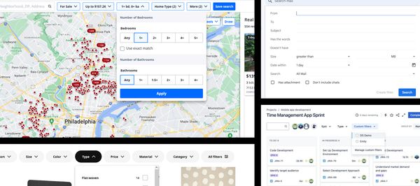
04. Searching the searches
Search bars can be fairly complex designs, so I looked at a wide range of search tools to get some ideas, some suggested by the product manager and other Numerator designers during design critique. I knew it would be important that the search tool options be easily accessible as filters may be applied or to quickly change whose attributions the user is looking up.
The team wanted to see if we should completely remove the checkboxes, and only allow the “approve” and “reject” buttons on each line. This is something I sought to test in user testing sessions and talking to users.
I spoke to four users during the design of the tool, three of them I set up a user testing session with.
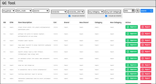
05. Lo-fi testing
One of the designs that I tested included additional buttons that felt too visually crowded, in addition to not necessarily creating the friction that was needed which was to perhaps slow down users in making a decision.
I’ve learned a few things as I talked to users:
- They all had their own preferences on how they process the data, one at-a-time or bulk editing.
- The order of the columns mattered: they preferred to see the “new brand / new category” first and then the “old brand / old category” columns as it made it easier for them to know right away what their direct report attributed.
An unnecessary micro-interaction
The mouseover tooltip behavior is something users are familiar with in the other tool they work with, but users thought this was harder to read when the item description would span over two lines which can happen if it is particularly long or they are working on a smaller screen size.
Less “aesthetically pleasing”, but more effective
Even though non-uniform table rows could result in taking more space vertically (and possibly more scrolling), it was easier for users to scan the data as they needed to see the full item description as some words that were not cut-off may make the attribution inaccurate.
06. Search filters
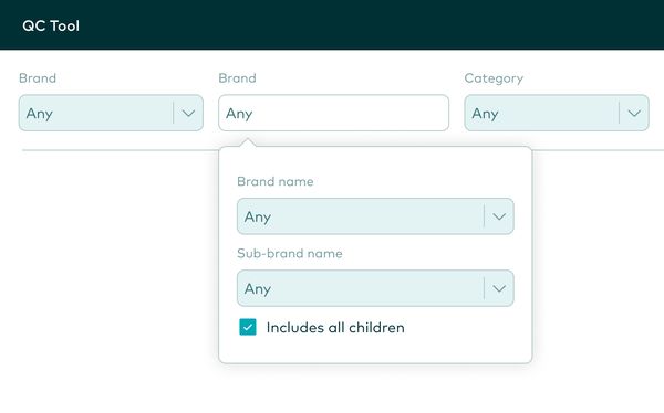
The search filters were consolidated where it made the most sense. Team leads are likely to ignore most of these filters, whereas they are more important for some data associates who need to look up specific brands or categories.
Takeaways
The feedback I've heard was positive from the users as some changes that may not seem impactful were actually extremely significant for decision-making. Anything that helped speed up the process that could alleviate their workload and give them more breathing room were appreciated so they didn't have to fight against the tool to get the job done before the end of the day.