Evolving Numerator's design system

Problem
When I joined as a designer at Numerator, there was already an established design system for designers and developers to use — but it needed to be maintained in order to not lag behind the products' lifecycle. Some components were still in sketching phases, others needed deprecated, and most needed to be updated to make a full use of Figma's new features as they rolled out. As new designs started to get implemented, some components were no longer reflected in our design library: we needed to actively update and maintain the design system.
Impact
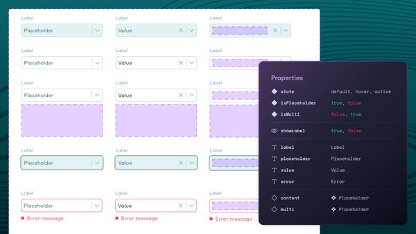
Components in our design library were refactored to make better use of new core Figma features. Throughout the following review and iteration, they became more robust using auto-layout with a flair of flexibility through variants and component swapping: less detaching components, which helps to keep everything aligned for visual design such as defined padding and colors, as well as less time spent on pixel pushing.
This work resulted in faster iterations across the organization ultimately bringing products to market at a faster pace. For every iteration that needs to be worked on and tested, it becomes easier to manage for designers thanks to these guardrails.

01. Iterating is easier (1/2)
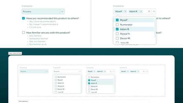
An example on how patterns help to keep the UI cohesive using a modified Select pattern. In this case, wireframes were used specifically to show how the user will be filtering their search. When stacked against the previous design workflow we were able to observe roughly a 25% increase in susbsequent iterations.
Process
I looked in Figma's Community page for a few known B2B design system libraries on Figma such as SalesForce's Lightning and Shopify's Polaris to research how design team organize their components, how they used variants and patterns. I also looked through design system websites.
I was already creating these patterns and components in my own design files when I was showing the wireframes and prototypes to my team as well as usability tests. This was a good way to also test and see if I thought other designers would appreciate these components built a certain way — does it help them design faster? For example, we often found that we often had to remove certain component interactions so they were sometimes not included in the component themselves (a wrong interaction sometimes lead to confusion for stakeholders and participants in usability tests), but were created within the patterns themselves. Certain interactions that may appear harmless actually caused more friction in the end for designers, so their inclusion needed to be thoughtful: are they needed at the component level or should interactions be moved at the pattern level?
Prioritization on which components would get audited and iterated on were based on needs: heavily-used components like modals and the select components were prioritized, but while the calendar components was not built as it didn't need to be tested with.

03. Flexibility with some guardrails
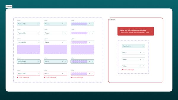
The Select component can be as complex as the designer wants it to be so they retain full control. Sometimes, a complex component is needed, other times wireframes are enough to present an idea — it always depends on the audience. On the screenshot, the Select component is missing a few states, but is more fleshed out than the previous version as the designer would have to create building blocks to support the full pattern. There are additional components created to make the Select component appear like what it is on production for microinteractions.

04. "Hey, can I copy your homework?"
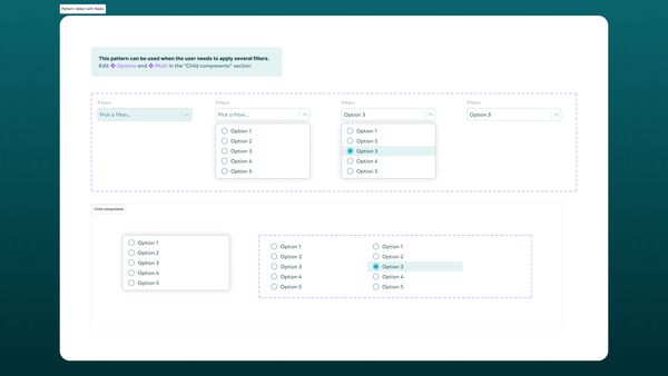
An example of how the designer can easily change anything by using a pattern which uses the Select and several other components to make this work. The design can change at any time during the iteration process, allowing flexibility while keeping the design component consistent. Because of the way the component was assembled, updating the wireframes and prototypes is not as menial and keeps the designer focused on solving problem, not pushing pixels.
I talked with other Numerator designers and developers as needed since they are the primary stakeholders (including myself) to ensure collaboration and transparency. During my own meetings with the design lead, we'd go over the components to ensure alignment first before components were mentioned in meetings with the developers.
Documentation was started to help carry institutional knowledge: basic documentation for copy and design guidelines were started on Confluence or Figma, based on stakeholder needs. On Figma specifically, guidelines were written so any designer could understand how to use the component as needed, including examples of how they could be leveraged.
Takeaways
Design systems have a tremendous impact for the design and dev teams on execution and alignment. It's easy to get lost in the weeds or be too ambitious, so it is important to understand what works and what doesn't work with the team — essentially, treating the design system as a product and empathize with stakeholders.